
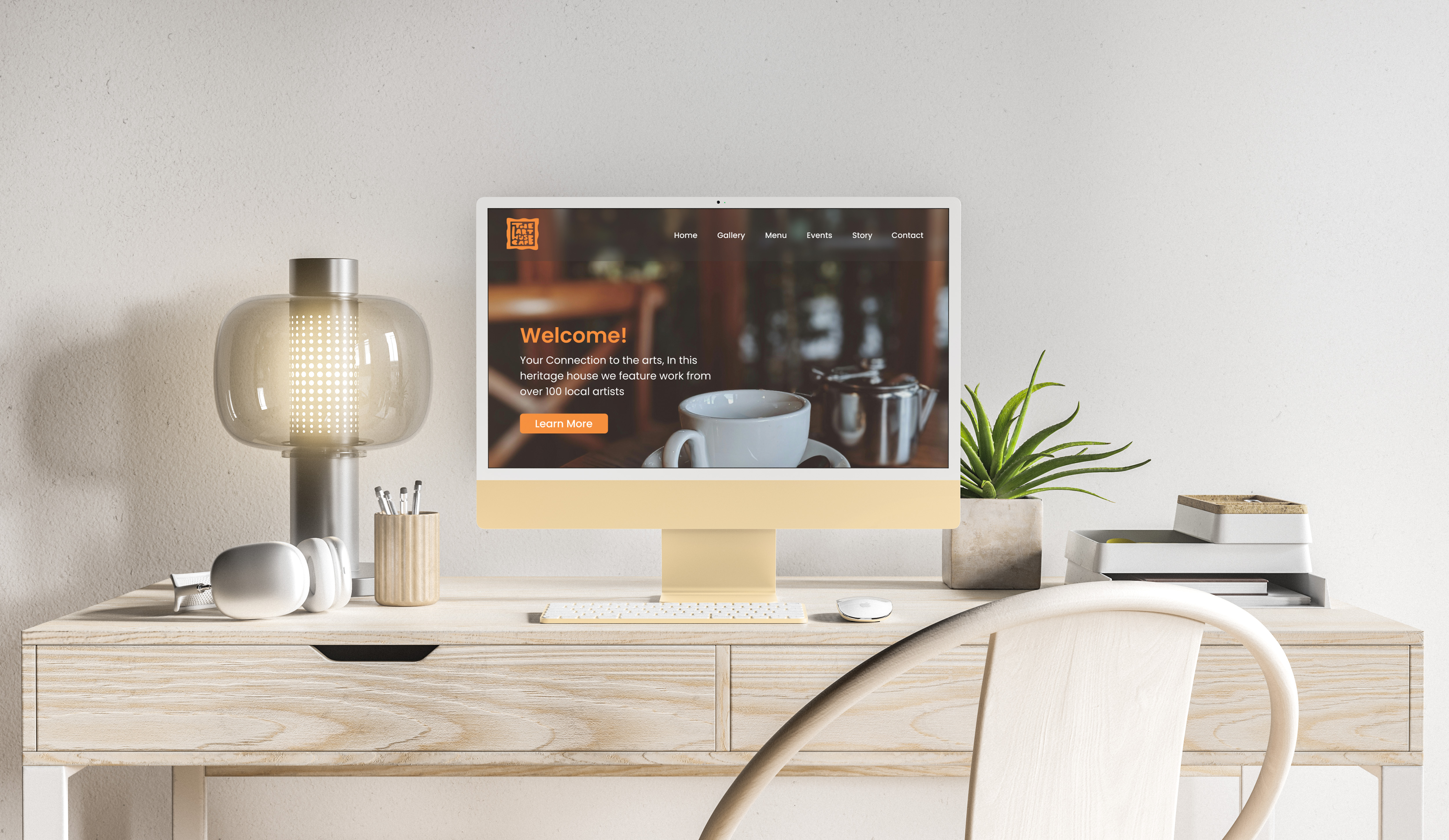
The Art House Cafe
Brewing up a new identity
This was a project where I was tasked with finding a business I liked, believed in, or wanted to redesign. The project started with logo development and progressed to a complete brand redesign.
Key Requirements & Goals
• Learn and get to know the business
• Define pain points within the original branding
• Create a connection between the brand and it’s customers
•Create a visual identity for the brand after researching, ideation, exploration, and refinement
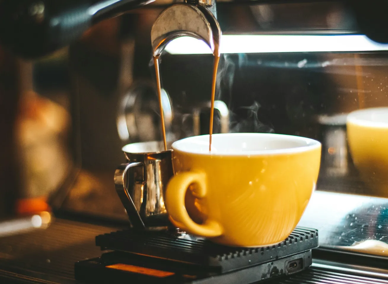
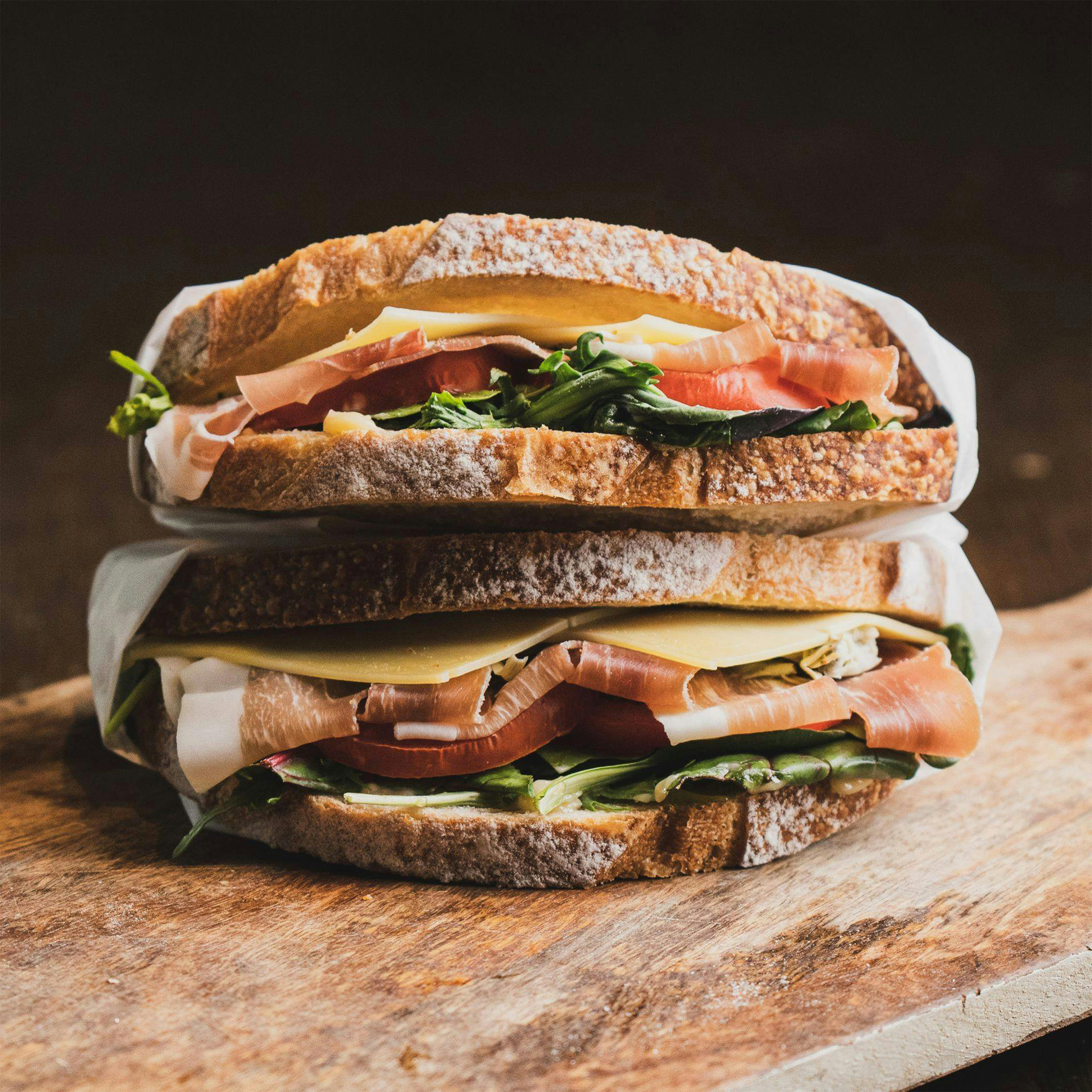
The Art House Cafe is an amazing business that truly believes in community and celebrates local talent from performative, musical and fine arts. Not only is it a place to grab some delicious coffee and artisanal food, but it is also a place to celebrate everyone in the arts. It is important they have a logo that represents their brand, its values, and is able to connect with their customers.

Why I decided to redesign a beloved cafe
After researching, it was apparent that The Art House Cafe needed a redesign that would reflect the brand’s values and feel, but also connect with the target audience. The approach I decided to take was modern, clean, but also highlighted the artistic side of the business. The design intent was to showcase the uniqueness of the establishment, a place for people to gather and celebrate a common love: art.
From grounds to concepts
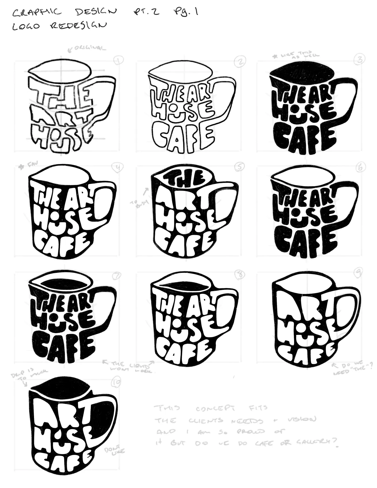
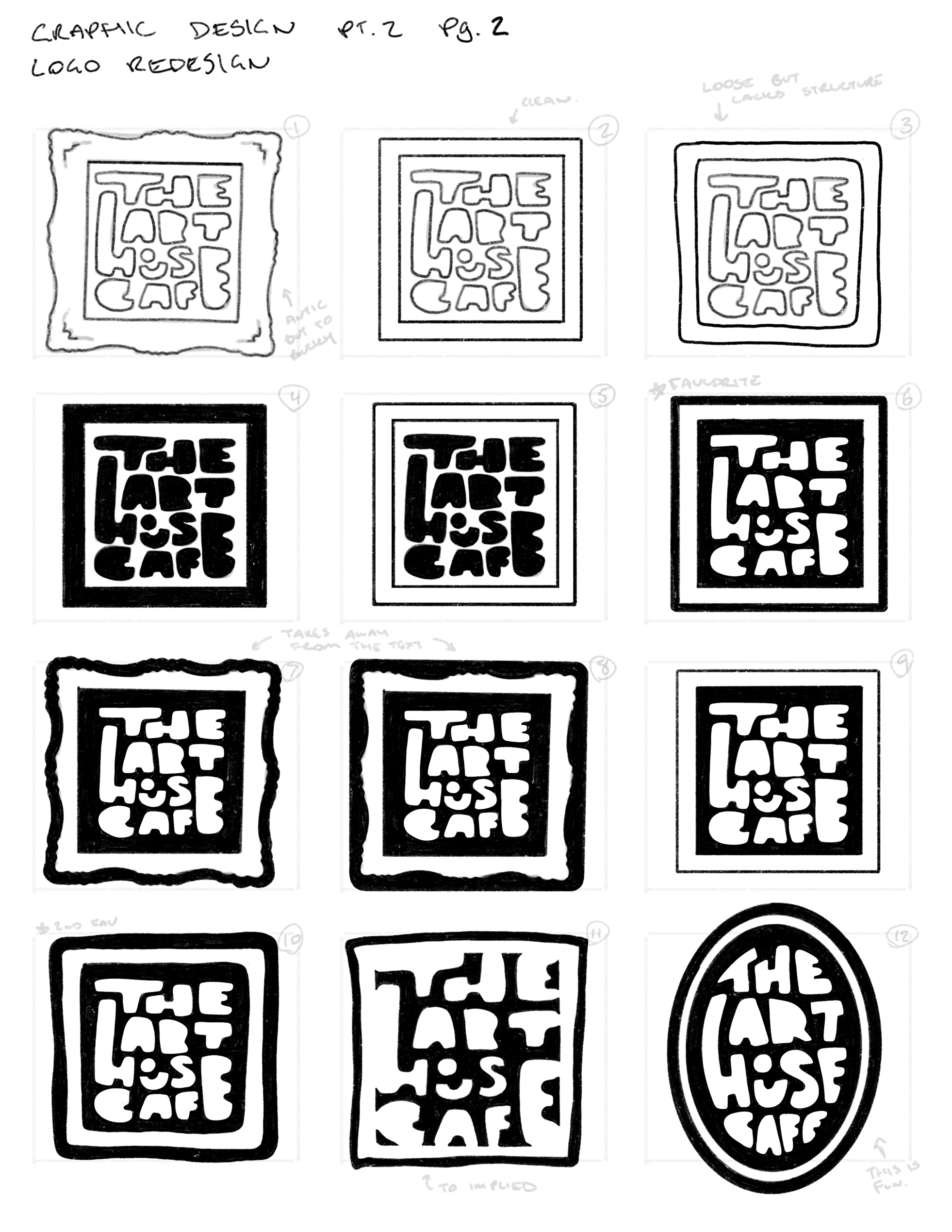
After researching and applying the concept to the design brief and making sure it lined up with the brand’s goals, values and aspirations, it was time to start sketches. The many concepts and renditions were a way to explore as many options as possible. I wanted the logo to feel artistic and modern, and to do that, I made a custom typeface that was strong but represented that feeling of originality.
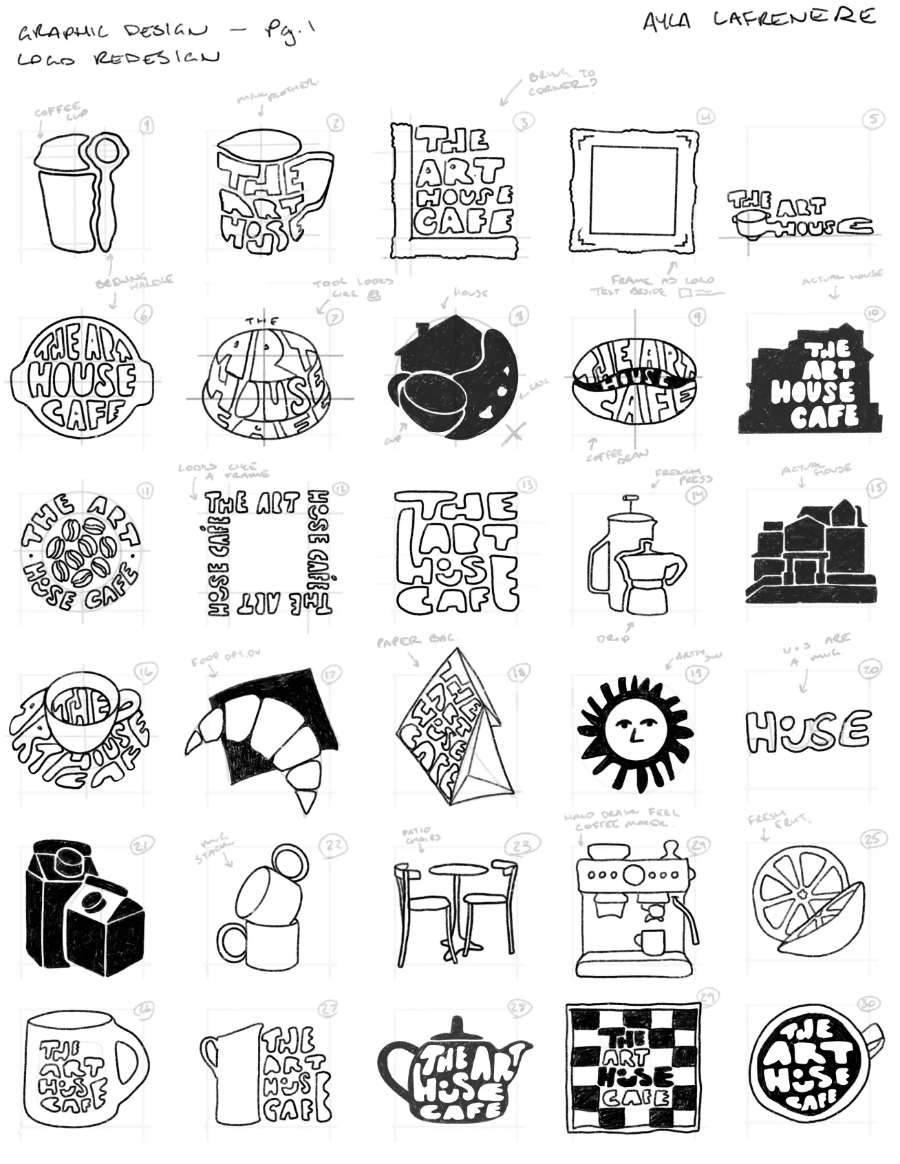
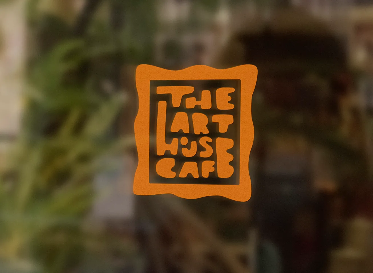
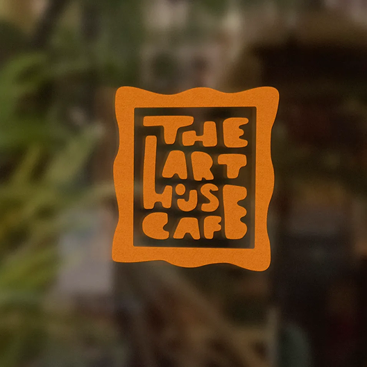
The art within a frame, final concept chosen
After consulting with peers and going through the professor's review, the two strongest concepts are shown above. The first being a more technical approach, following the idea of ‘cafe’, using a milk frother and the custom font. The second is a less literal approach and follows what the cafe stands for as a whole. Focusing less on the cafe aspect and more on the community and arts that the business represents. A frame, inspired by the local art that the cafe hangs up and the antique frames used as decor within the house.
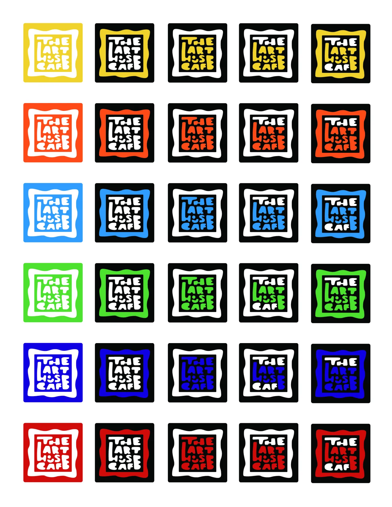
Finishing touches – How does one choose the perfect colour?
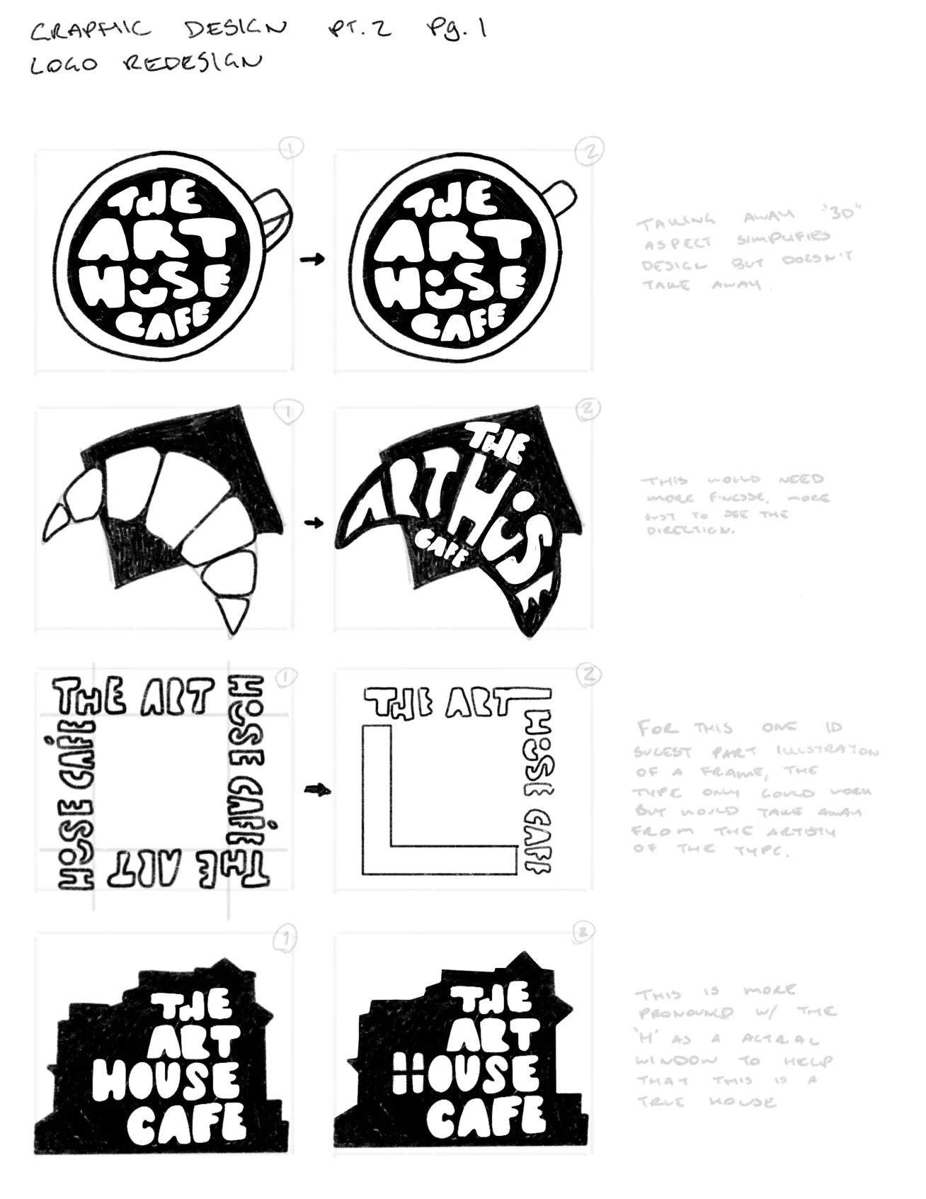
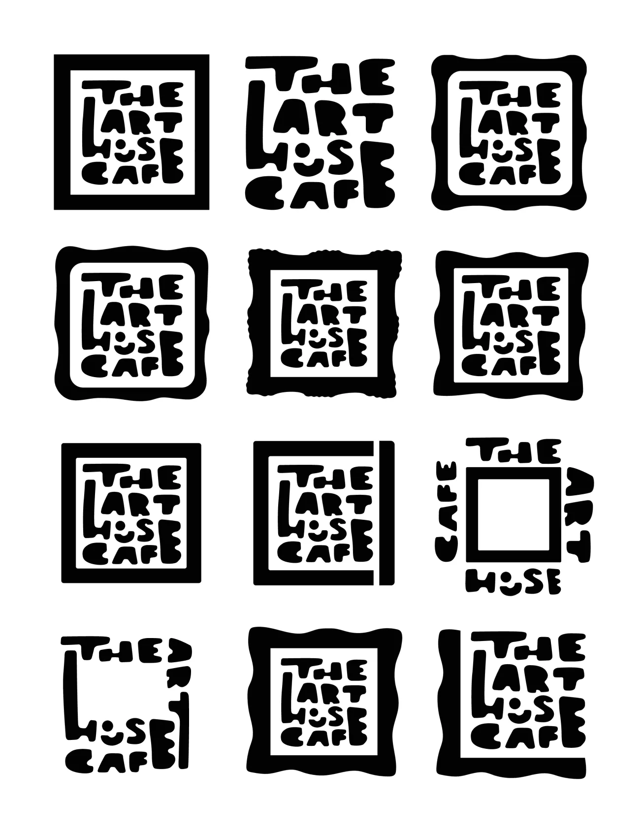
After finding two core concepts to explore, it was important to digitalize them. This would allow for a better visualization of what each version looks like and could look like at the end of the project. It also gave an opportunity to further refine the designs, making necessary clean-ups and edits.
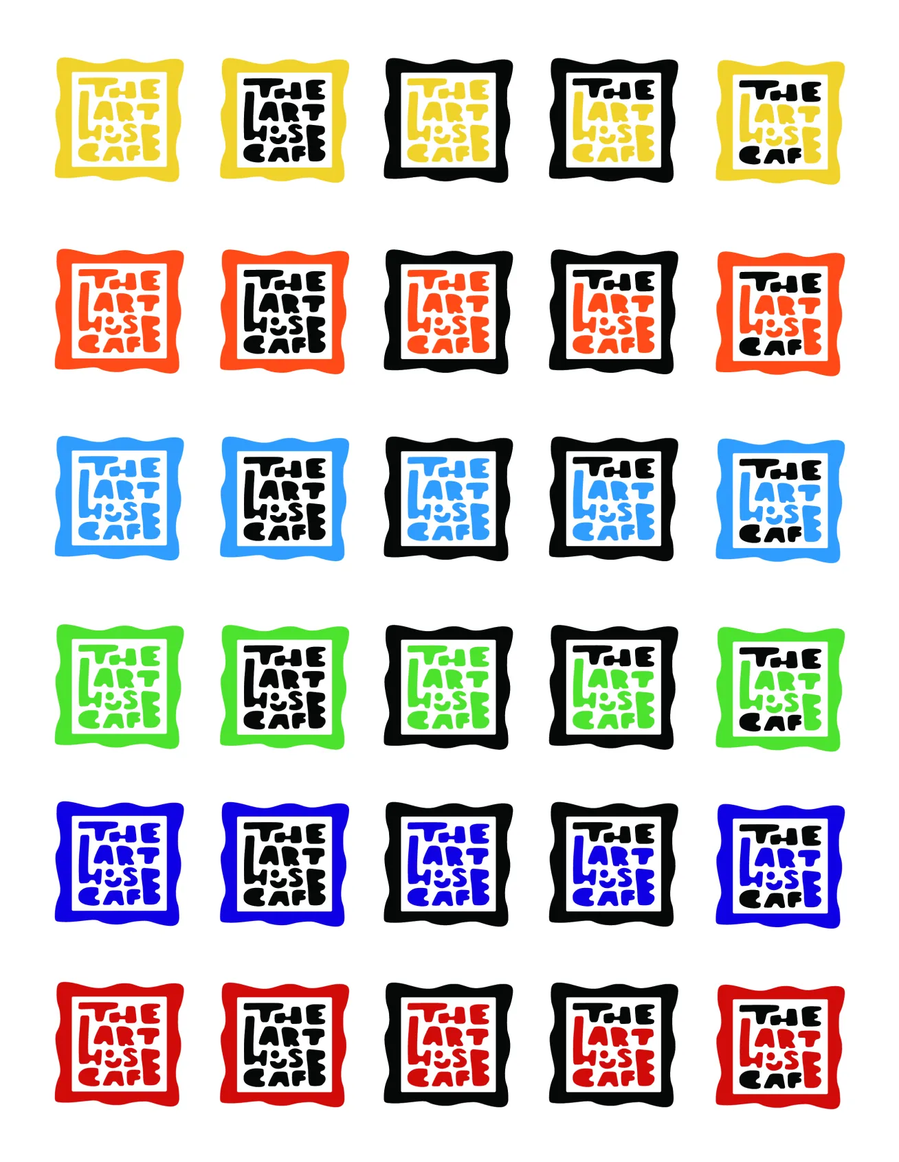
It was decided that the brand’s primary colour would be orange. This is because it is an energetic colour that inspires creativity and motivation; All attributes of the artists that the cafe attracts.
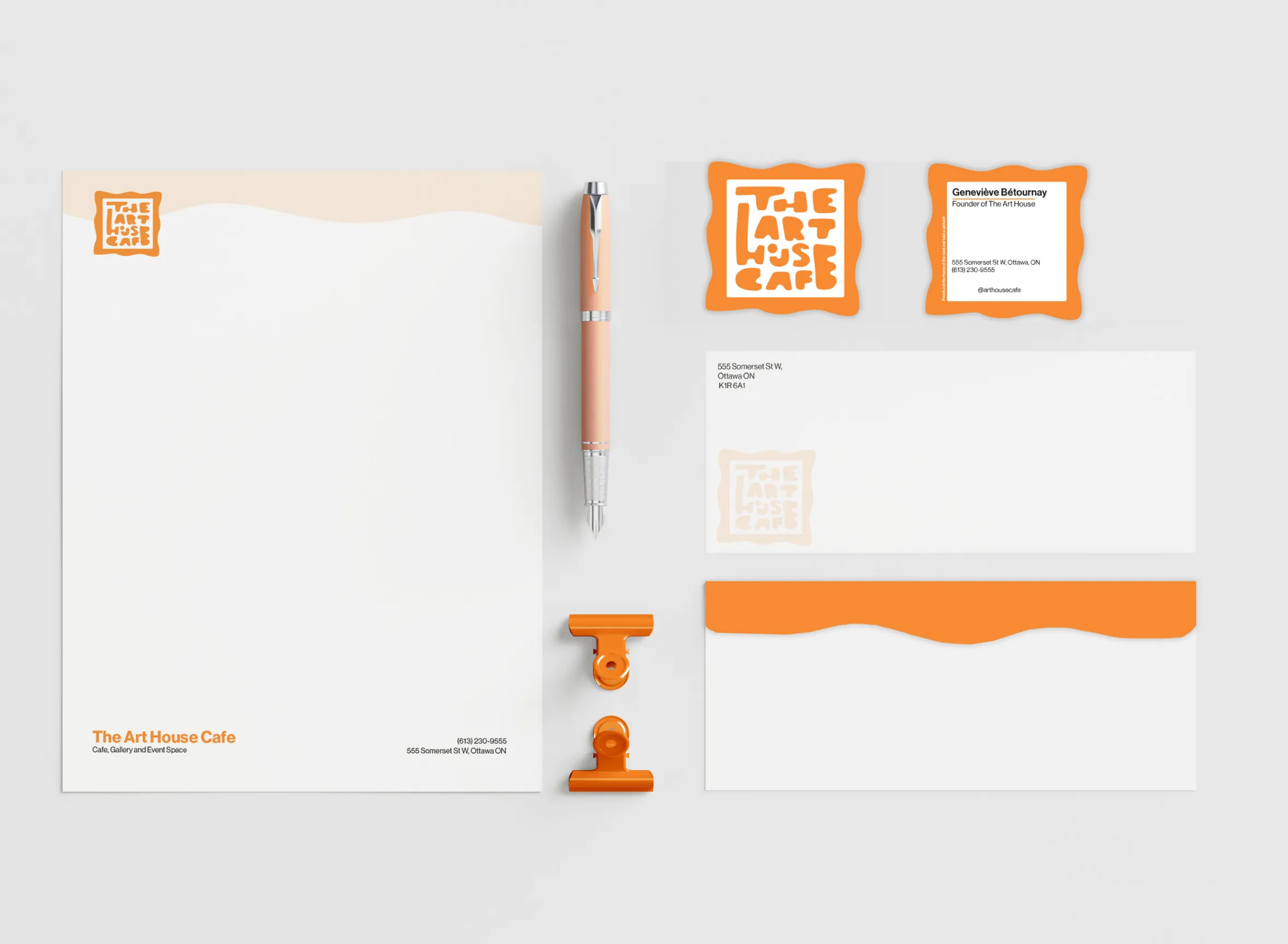
The perfect brew for coffee, culture and community
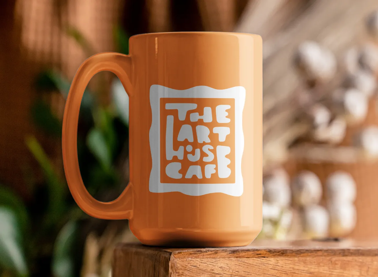
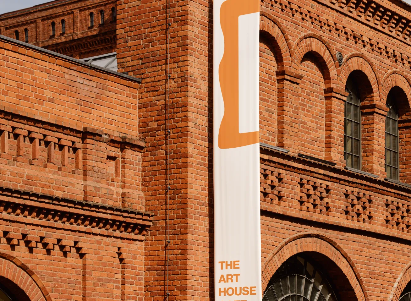
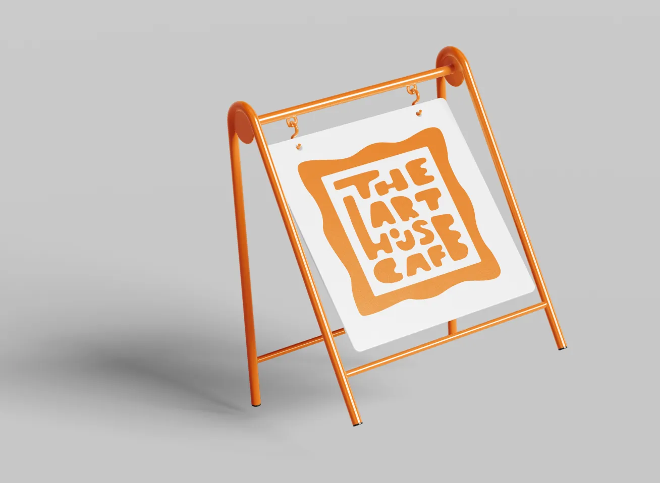
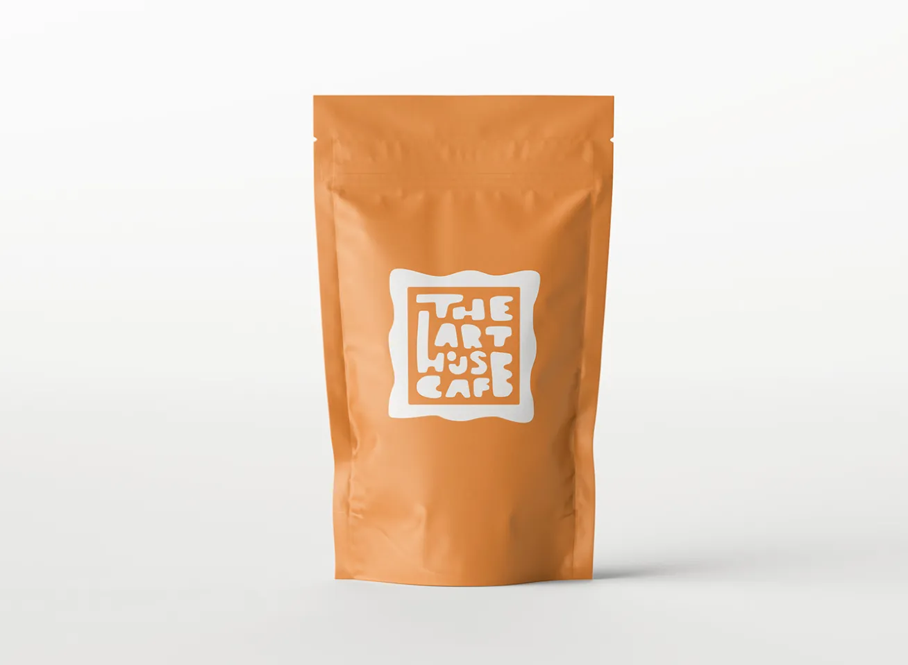
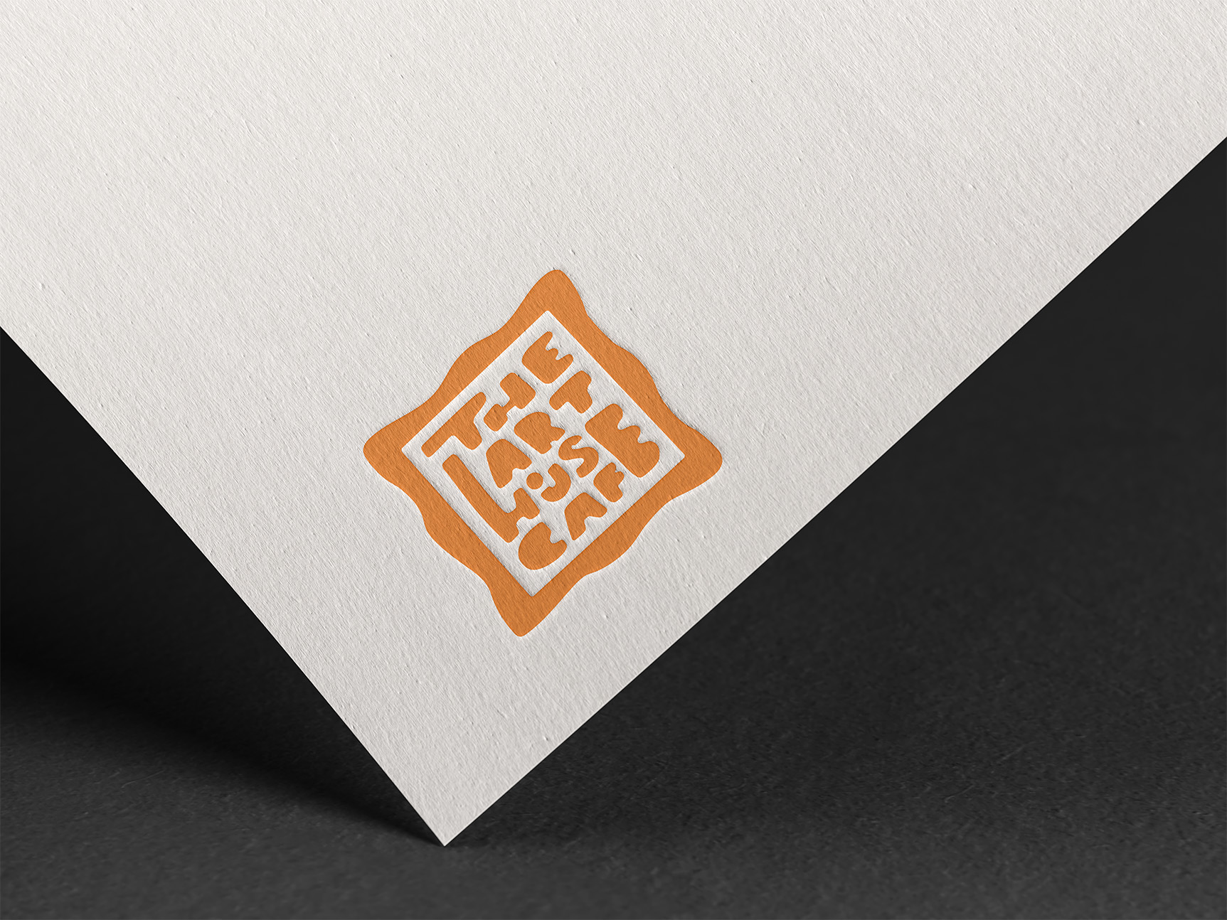
The final rendition of the logo showcases an abstract antique frame. This is because in the cafe itself, they showcase local art all over, along with the use of old frames for decoration. I not only wanted to capture the art of the business but the community it reflects and strives to build. Wanting to represent that The Art House Cafe is an incredible place for all who love and enjoy art or some good coffee.
The aftertaste of what I learned
In the process of making this redesign, the question of readability came into play. For legibility, I made sure that the custom type was edited for the final rendition, by fixing the spacing, layout and size of the font.
Skills strengthened
• Strategic thinking
• Concept development
• Consistency within design and layout
• Brand & visual identity
If I were to revisit this project, I would like to further explore some of the design choices or even try a new concept. Mainly as an exercise for myself and a reminder of how many directions and shapes branding can take. I would also like to make the logo slightly more legible, even though it was a design choice.As for what I learned about myself as a designer, I found that it’s okay to scale down your ideas. It is not easy, but it is important to focus primarily on the client and their needs.

I'd love to hear from you!
If you connect with my work and are looking for someone to help bring your design vision to life, I'm here for it. Let's talk about how we can create something meaningful together.