
Families For Addiction Recovery Campaign
Breaking the silence and being the voice
The goal of this project was to create an awareness campaign for a non-profit organization that holds meaning for me. FAR (Families for Addiction Recovery) is a non-profit organization dedicated to supporting parents and families affected by a loved one’s addiction. They provide 24/7 parent-to-parent support, advocate for better government polices, and work to spread education and awareness across communities.
Key Requirements & Goals:
• Represent the organization and campaign in a meaningful, thought-provoking way
• Build awareness and inspire action
• Maintain clear, consistent communication across all deliverables
%208.jpg)
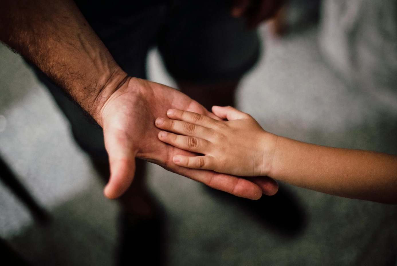
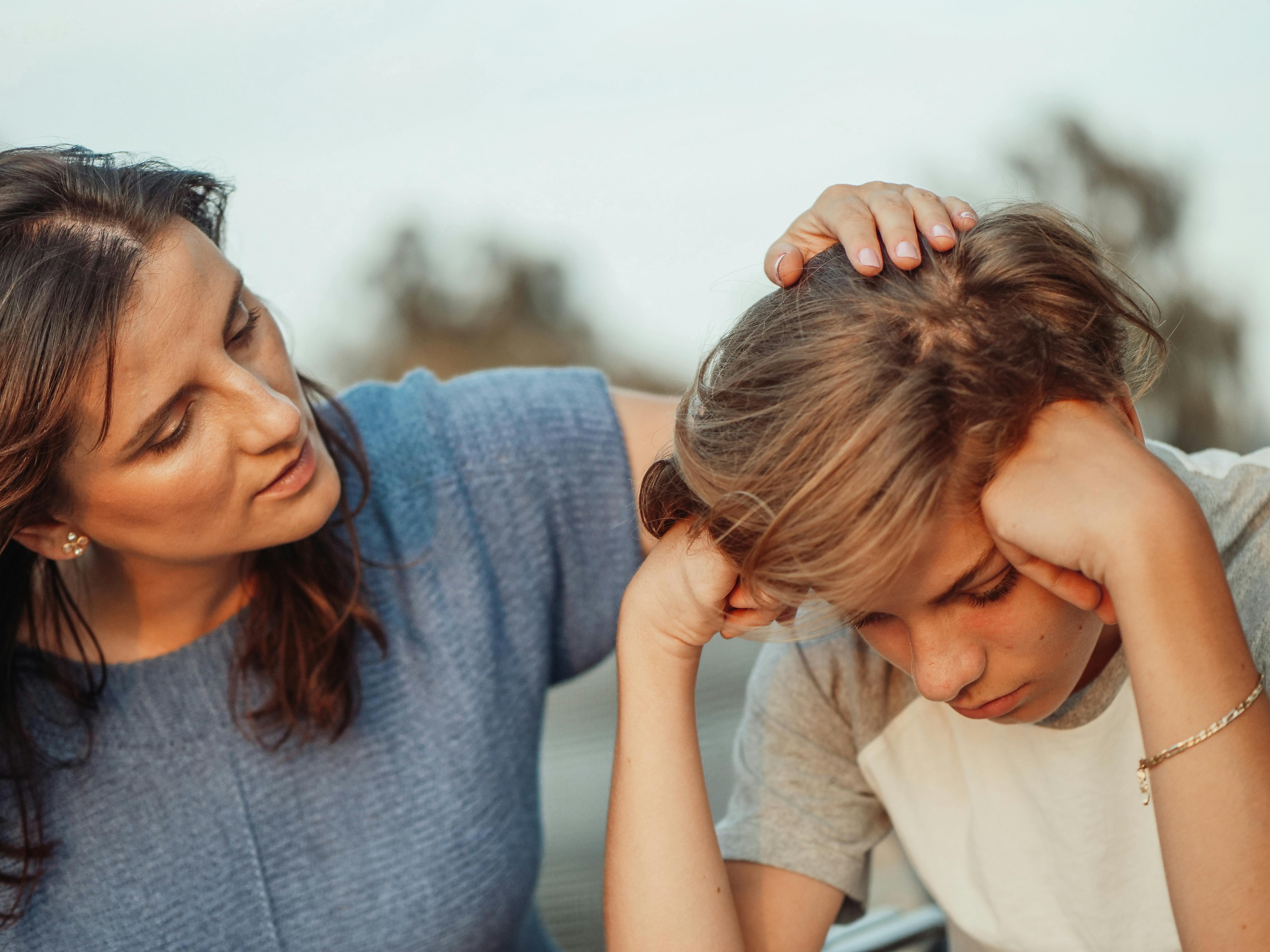
Understanding the toll on younger relatives
When researching FAR, I found their main audience is parents, specifically, giving them the support and resources they need to properly help their families.
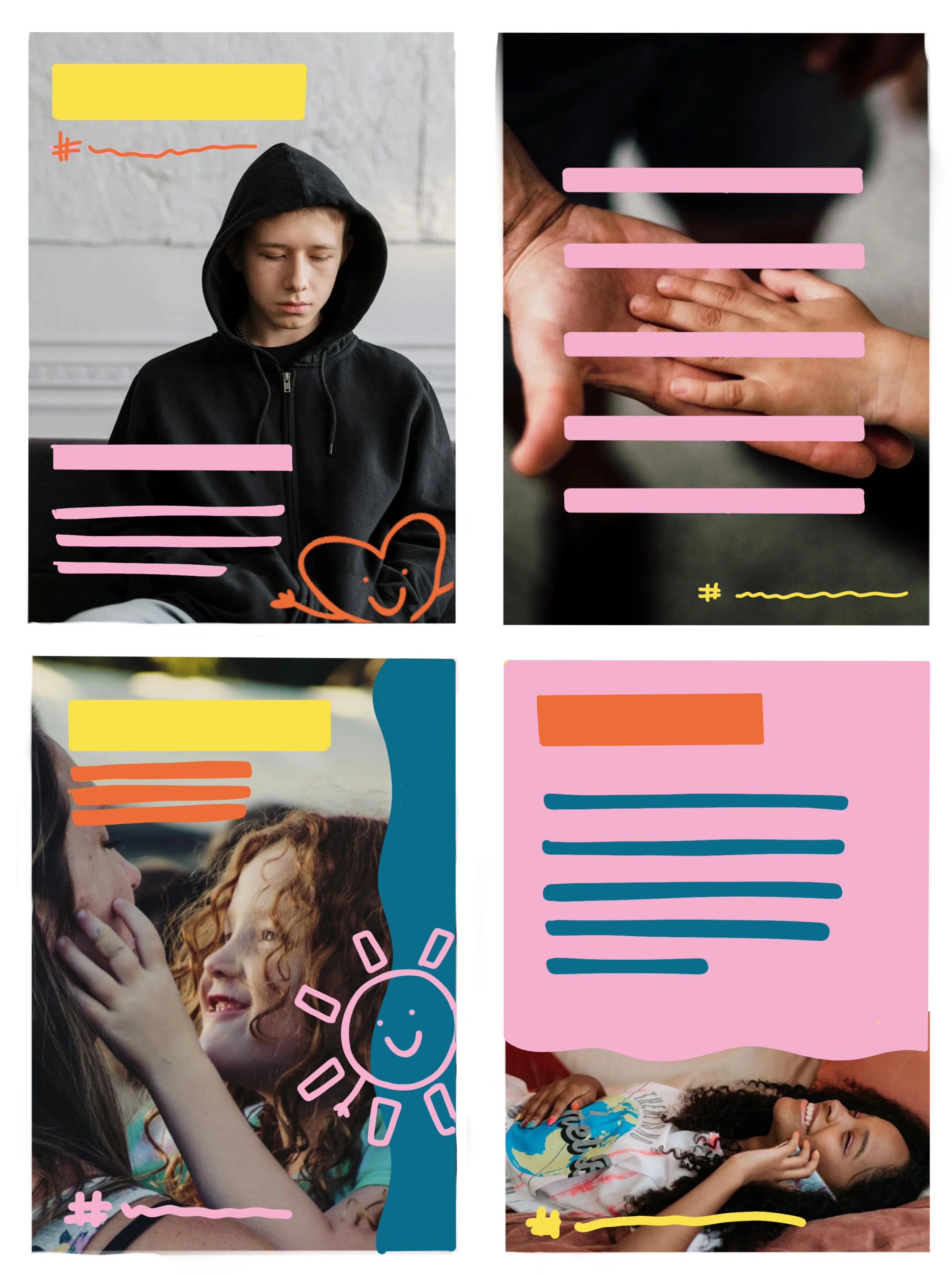
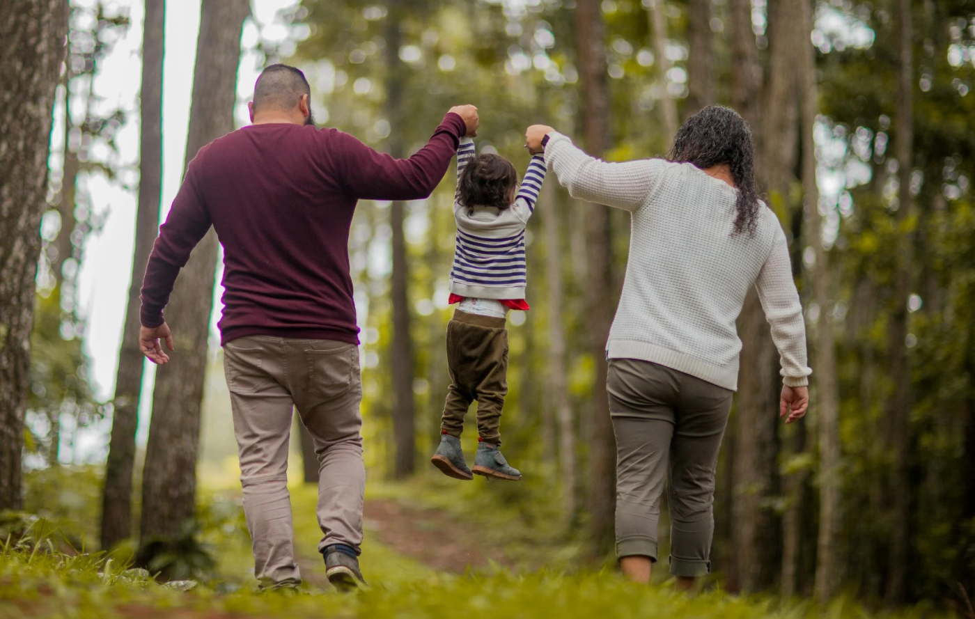
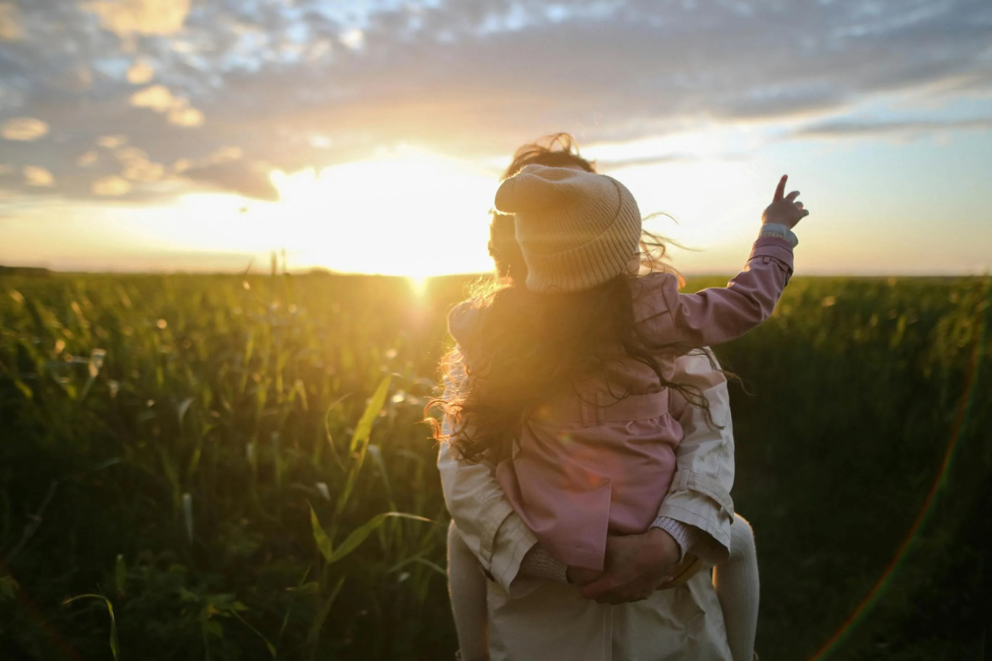
A vision for families & mapping out the message
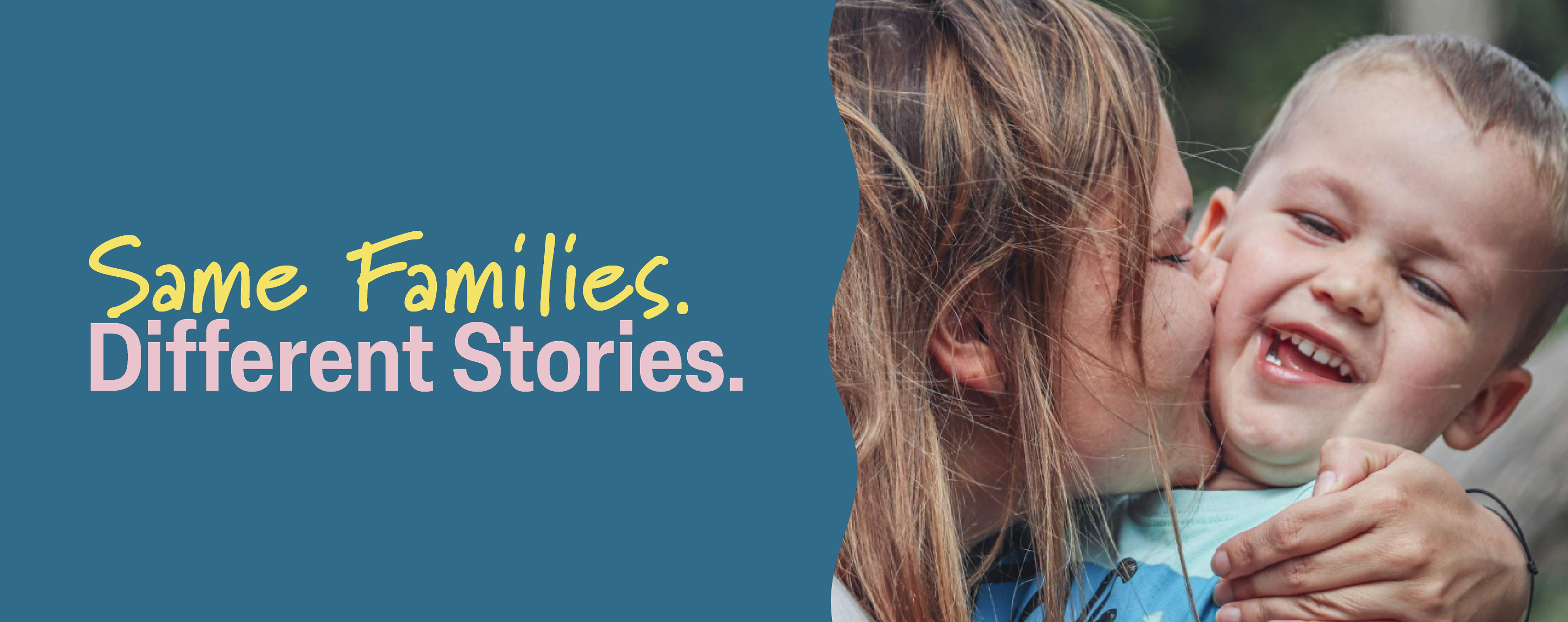
For the campaign’s concept, I felt it was important to keep the target audience as the parents, but shift the focus of the campaign to the young relatives and family members whose voices are rarely heard. This helps represent FAR as an organization that isn’t just for parents; they’re a voice for every family member. This is where the main slogan for the campaign comes from: Same Families. Different Stories.
It was important that I brought brightness to a heavy and hard topic that wasn’t too childish, but still brought trust, warmth and ease to those viewing it. The campaign, in a way, is a letter from those younger voices to their parents – a “hey, don’t forget I was there too.”
.webp)
%202.webp)
%204.webp)
%203.webp)
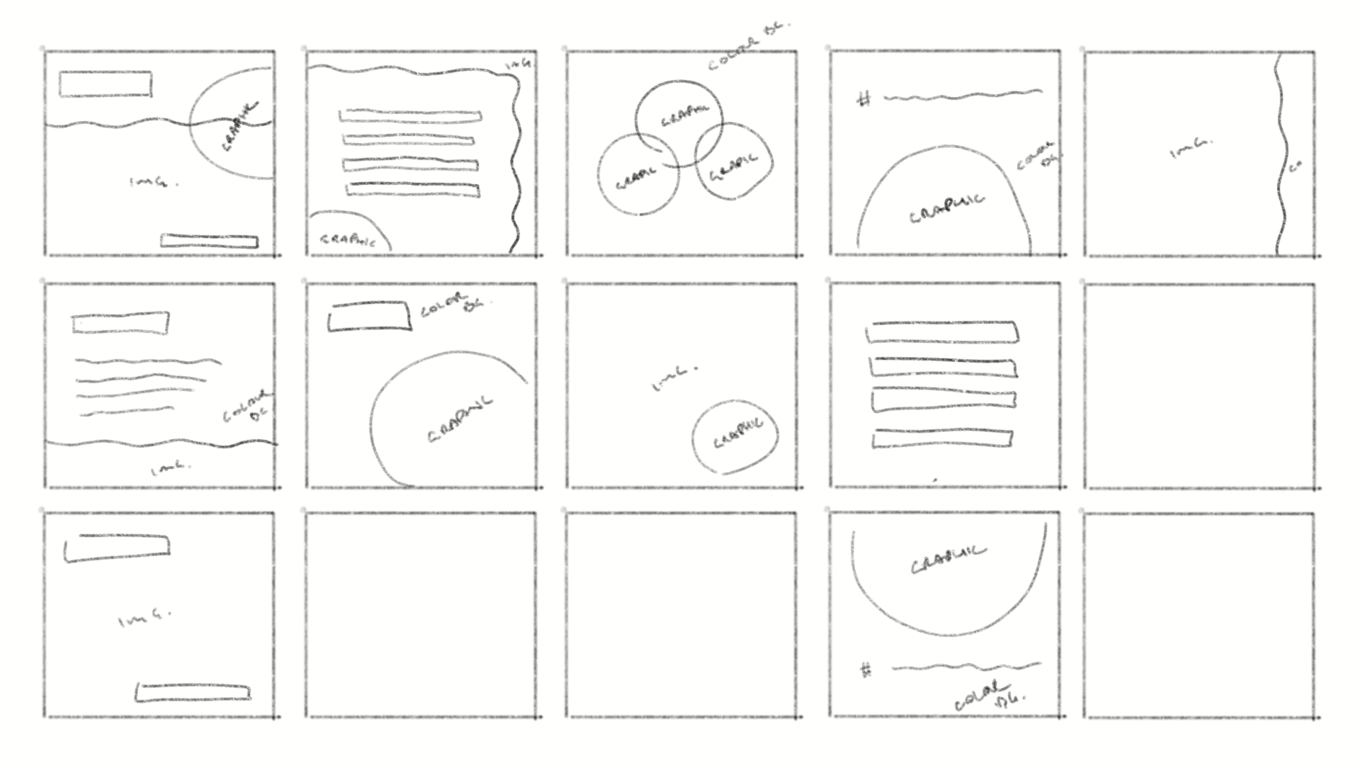
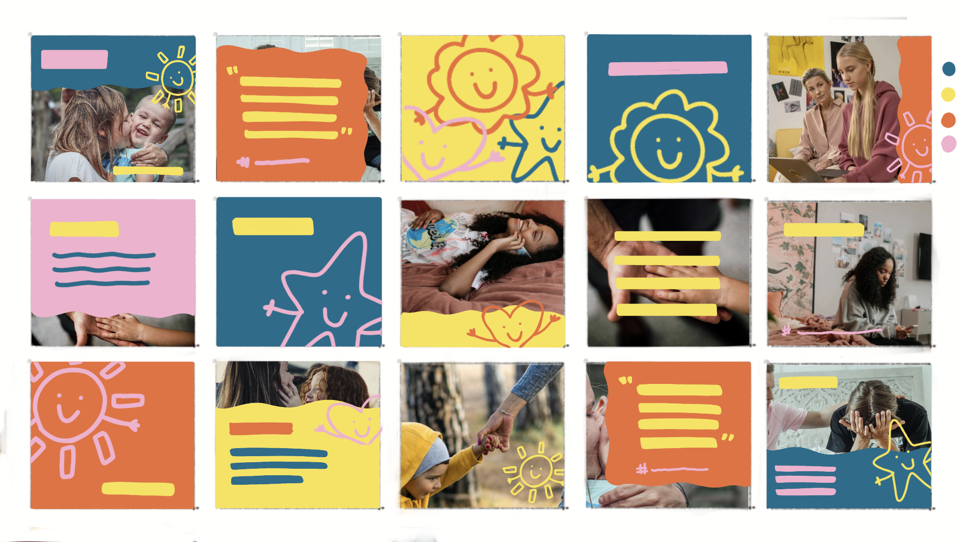
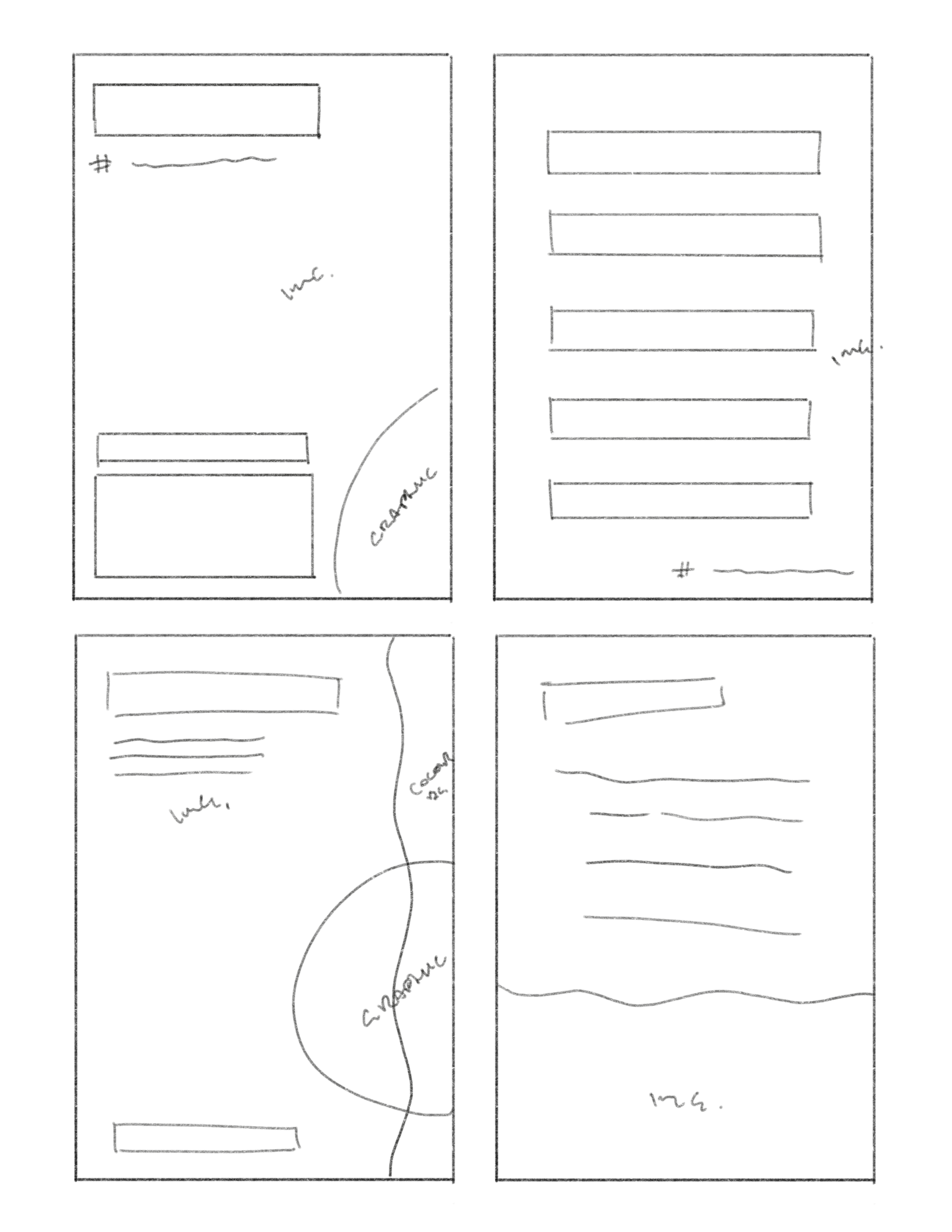
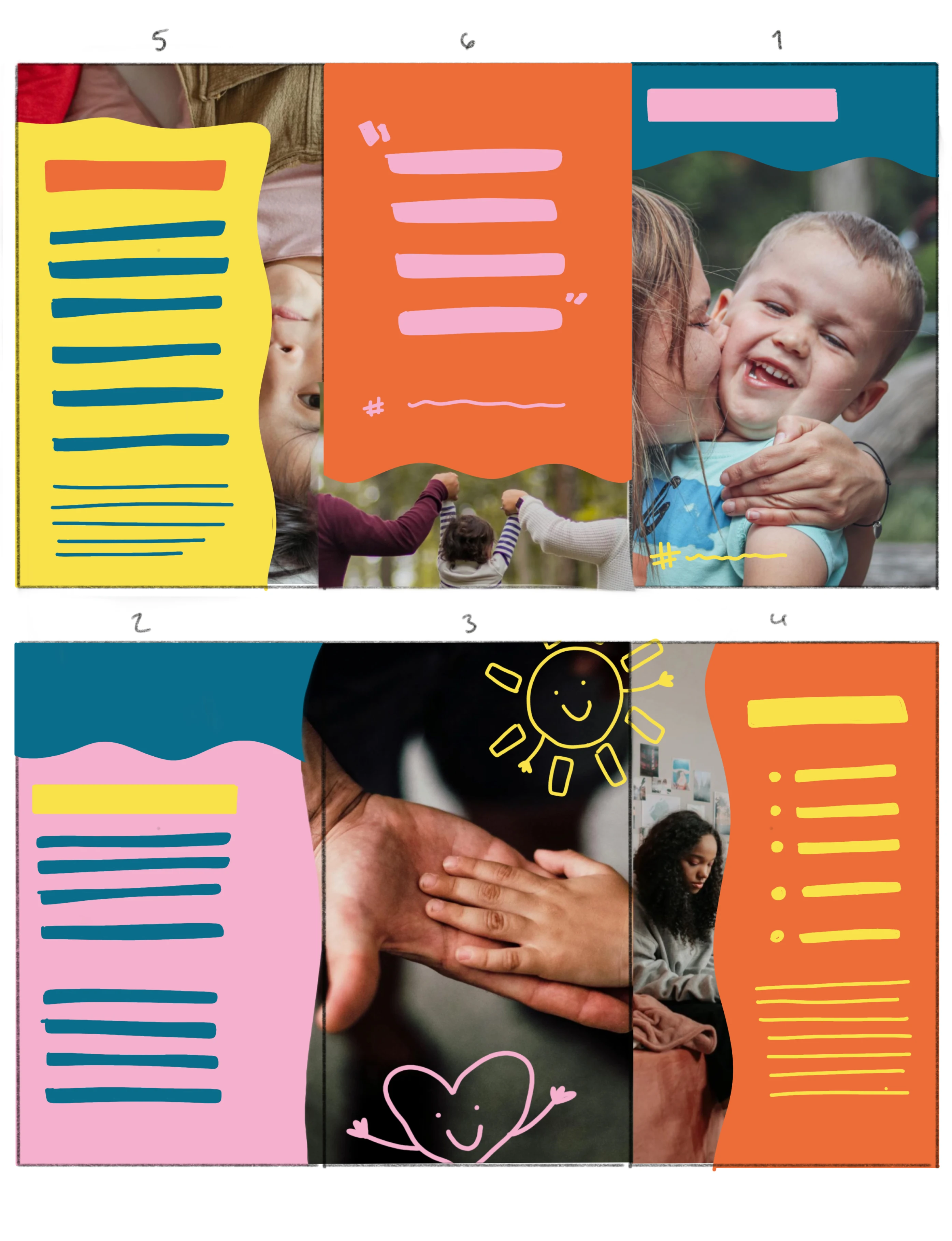
Making it happen
After sketching and colour blocking, I was able to clearly figure out how I wanted the layout the work with the colours. From there, I brought everything into Illustrator and InDesign to vectorize and add body copy.
The last hurdle
After consulting my peers and my professor. It was clear there were a few things that needed to be fixed and or changed completely.
Poster and tri-fold: Needed a layout rework. Taking away the gradient and making the image smaller. This will help with readability and accessibility. Along with that, the CTA needed to be brought up and made much larger.
Posts: Needed to be updated size-wise from 1080x1080 px to the new Meta standard size for posting 1080x1350 px.
%202.jpg)
%203.jpg)
%204.jpg)


%2010.jpg)
%2012.jpg)
%2013.jpg)
%2015.jpg)
A solution that heals
After making the necessary changes and applying the suggested edits, the final product was complete. A consistent design and finalized campaign. With the extra time I had, I created two additional deliverables: stickers as handouts and a website specifically tailored to the campaign.
The impacts and insights
Overall, the design system works together through the tone, colour, imagery, and messaging to create an approachable, trustworthy atmosphere. It ensures that the viewer not only understands the campaign’s purpose but feels emotionally grounded enough to engage with the resources and support Families for Addiction Recovery offers.
Skills strengthened:
• Concept development
• Audience understanding
• Visual Communication
• Problem-solving
This project meant a lot to me because of my personal connection to the topic. I was proud that I could properly represent the concept of the campaign through a thoughtful, working design.


I'd love to hear from you!
If you connect with my work and are looking for someone to help bring your design vision to life, I'm here for it. Let's talk about how we can create something meaningful together.