

Yahtzee Redesign
Rolling for a logo Yahtzee!
This is a passion project I chose to do for my favourite board game. Yahtzee, a forever-loved board game that is only made up of a few pieces and uses simple math. The idea was to transition the brand into a new look and feel. The goal was to revamp the brand to attract younger audiences.
Key Requirements & Goals
• Find a unique way to show and represent a timeless brand
• Create a logo based on information gathered
• Integrate modern design with younger generational influence
%202.jpeg)
%203.jpeg)
Setting up the game and reading the rules
The last Yahtzee redesign was rolled out in 2017. I found that with the other competitors in the industry are looking to catch the eye of younger generations by using eye-catching colours.
The primary target audience is young families who enjoy spending time together and are always ready for a quick game. The secondary audience is specifically young adults ranging from 13-27, who enjoy getting together with friends.
The proposal I had for this project was to prevent brand stagnation (maintaining interest for the generations to come), attract a younger audience and improve sales within the business.
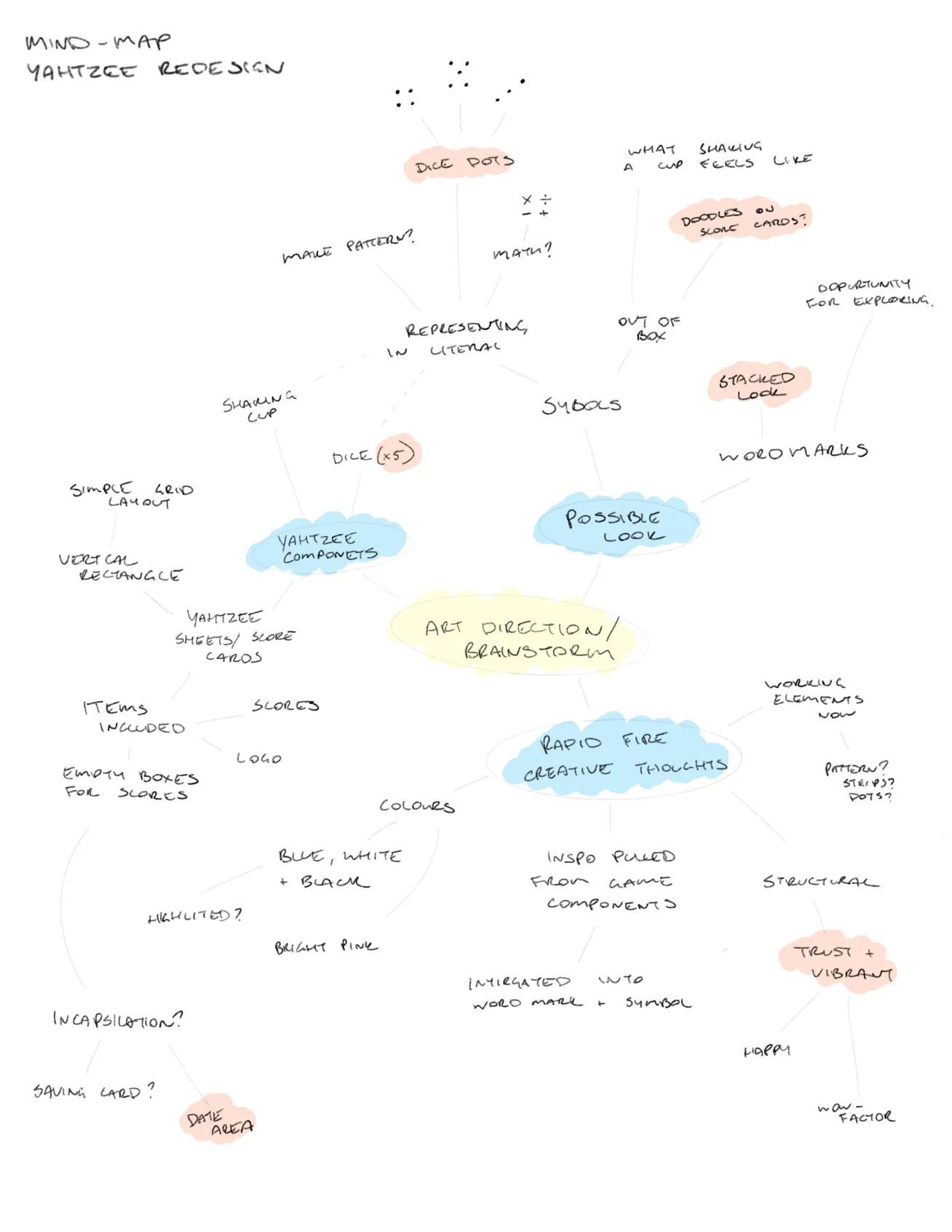
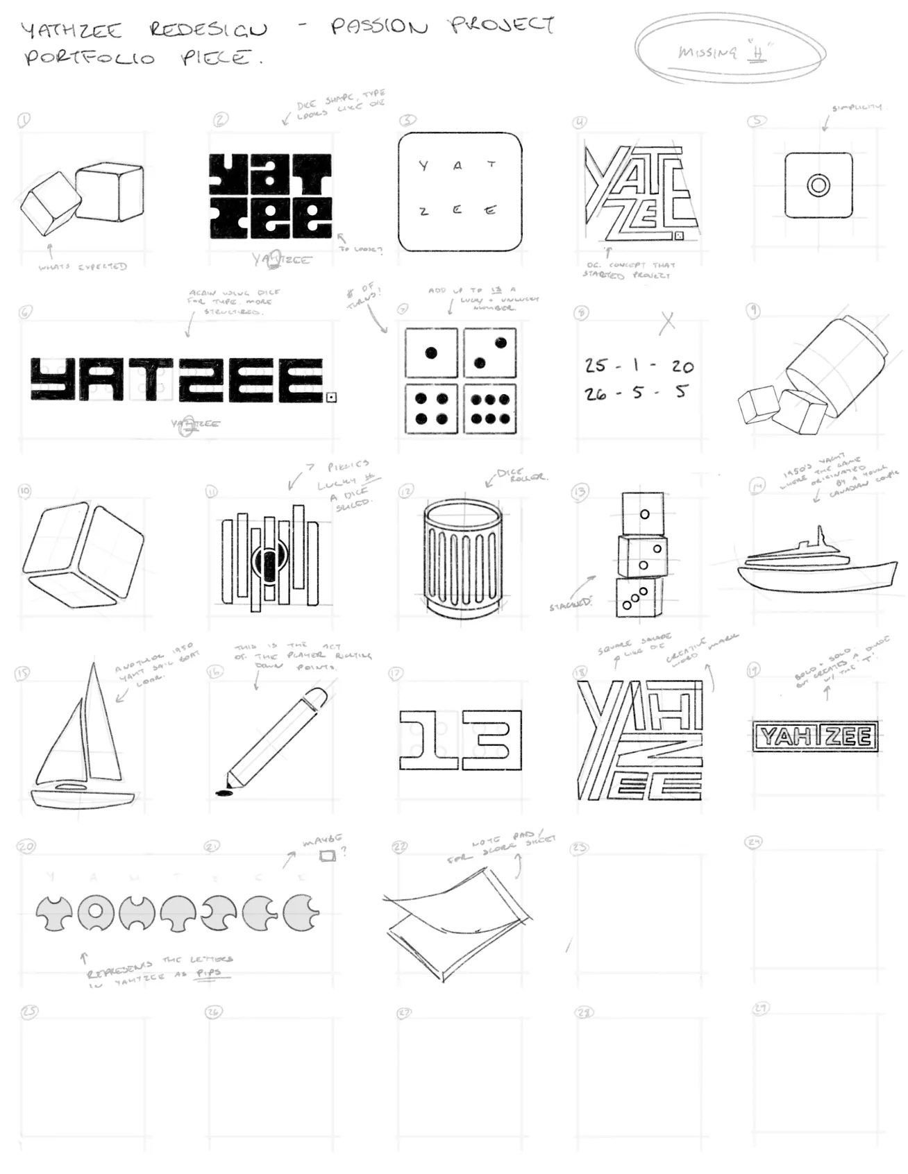
Game strategy & sketches
The original logo for Yahtzee is indeed iconic, but I felt there needed to be a direct connection to that and the game. With brands evolving, logos and branding are becoming more and more integrated with the business itself, rather than just being the face.
Breaking down the roll
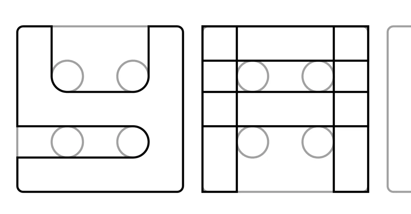
Yahtzee is made up of very few components: Five dice, a Yahtzee score sheet and a cup of some sort to shake and roll the dice in. The focus of the logo was to be on the custom typeface. I played with ways I could integrate the game’s main component, the dice, into the typeface.
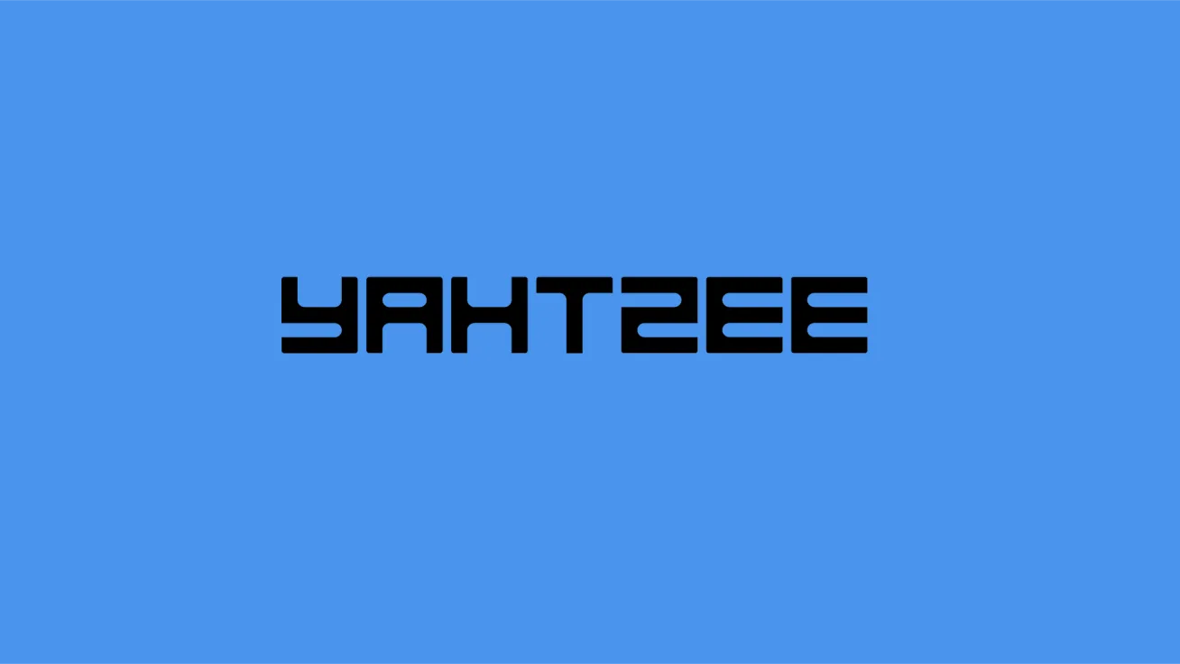
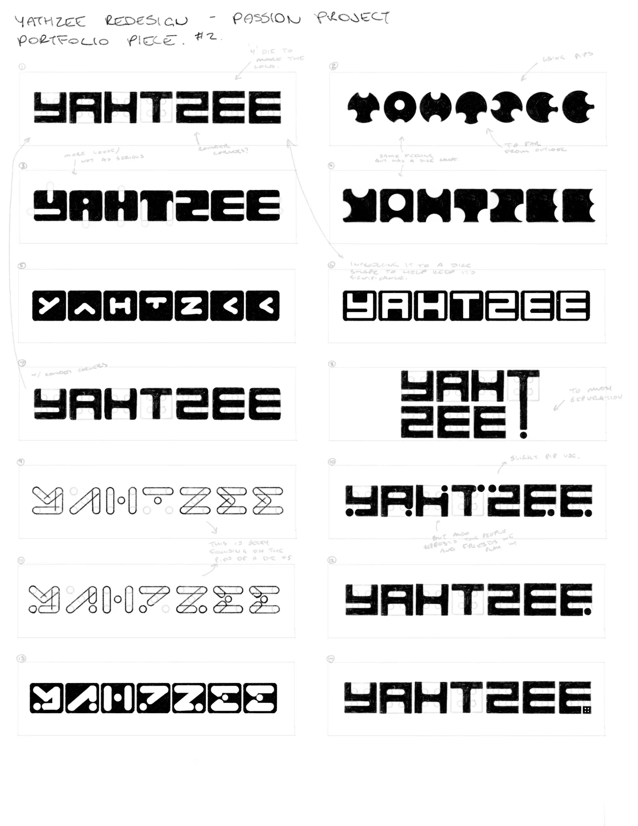
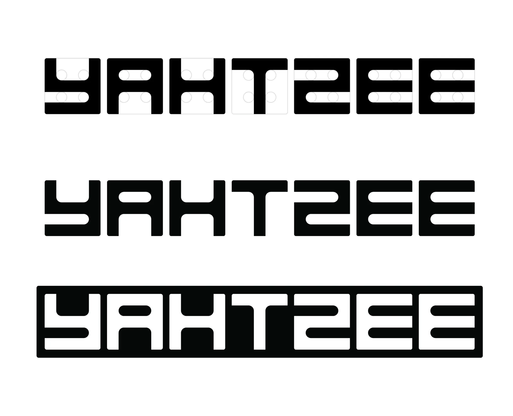
The strongest concept was a custom type design made around the face of the die. I started with four pips (shown above), fitting each letter around the pips to create the typeface.
YAHTZEE!
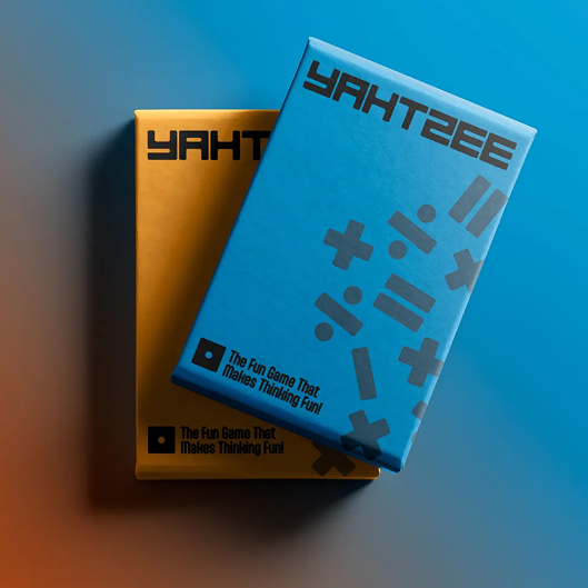
The design is very simple but conveys what Yahtzee is in a sleek, modern way. Through incorporating the dice into the design of the typeface and using colours that speak to the younger audiences.


Tallying up the score to see how I can do better next time
In the process of making this redesign, the question of readability came into play. For legibility, I made sure that the custom type was edited for the final rendition, by fixing the spacing, layout and size of the font.
Skills strengthened
• Strategic thinking
• Concept development
• Consistency within design and layout
• Brand & visual identity
If I were to revisit this project, I would like to further explore some of the design choices or even try a new concept. Mainly as an exercise for myself and a reminder of how many directions and shapes branding can take. I would also like to make the logo slightly more legible, even though it was a design choice.As for what I learned about myself as a designer, I found that it’s okay to scale down your ideas. It is not easy, but it is important to focus primarily on the client and their needs.

I'd love to hear from you!
If you connect with my work and are looking for someone to help bring your design vision to life, I'm here for it. Let's talk about how we can create something meaningful together.